Saturday, December 9, 2006

Designing Signage Assignment


One of the first assignments we were given was to select a partner to work with for the whole semester on store that we would create. The store my partner and I designed was a professional yet trendy retail store. In which we would sell merchandise for the professional woman but we would also focus on modern/trendy clothing.

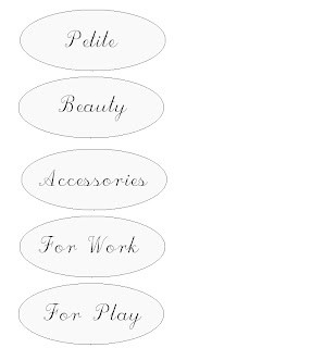
In this signage assignment we used the logo we created in our store “Le Chic”. And designed three different types of signage’s for the store, in which our store’s colors and logo would be incorporated. The three types of signage’s were store front sign, departmental sign, and point-of-sale sign. For the store front design we used our logo but in a larger size. For the departmental sign we focused on black and white oval shaped signs. And, for the point-of-sale sign we kept it simple by stating how much items were marked off and letting customers know they were clearance items. This assignment was very helpful because I learned the different types of signage’s are needed within a store depending on the merchandise being sold. Whether it be clearance merchandise or newly arrived merchandise it is important that customer are able to find what they need and sign are able to help customers navigate in the store.

Friday, December 8, 2006

Store Window Display


A great opportunity we had during the semester was to go to a store and come up with a store display. This was a great experience which allowed us to feel and see what visual merchandisers do on and every day basis. The store I went to was Hallmark. Our instructor chose the partner we would work with on the store display. One of the first things we had to do was to contact the owner of the store and arrange a time in which we would come in to create the display. Once we arrived in the store we talked to owner and were given a theme to work in. The theme was UK, since she had new UK merchandise and basketball season was near the corner. In the end the window display was well coordinated and our main colors were royal blue and white. This assignment was a great way for people to experience and get a feel of how much creativity and time it takes to come up with a store display.

Planogram

The layout chosen for the wall display is informal and the theme of it is Valentine’s Day. During this romantic celebration a lot of potential customers will be looking for products, in this case clothing and accessories, to give to their love ones. And a great way to make costumer’s task easier is to coordinate clothing together along with the accessories needed to attain a trendy and sophisticated outfit.
This assignment although, one of the most time consuming was one of my favorites because I was able to play around with clothes to come up with colors that belonged in the theme, in this case Valentine's Day.

Lighting Plan and Budget


The last project of the semester was the lighting plan and budget. In this project we were asked to work with our partner, the one we chose to create the store. The instructions were to find lighting that would complement ours stores environment and would be the most effective. We had to take into considerations the different types of lighting whether they be halogen, translucent, fluorescent, etc.

By the end of this project I learned the importance of lighting and how it plays a crucial role in the store’s environment. For example, fluorescent lighting provides the best ambient lighting and are the least expensive to operate. But, they are not effective to accent merchandise or displays a must for retail setting. Therefore, knowing what you want for your store and learning the differences the different types of lighting out in the market is essential in creating an effective environment for your store setting.

Shadow Box Display


Another project in which we worked in a group of four to five people was the shadow box display. In this project we were asked to design a shadow box display using the principles of design. In this project we chose a detergent theme. The color scheme was primarily baby blue but there were other color shades in the display.
This assignment helped me in understanding that height plays a big role to how well shadow box displays can look. One of the biggest challenge we faced was knowing the right height to locate each item in the display, so that the brand name for each would be visible. We played around with all of the products to finally come up the best way to display all of the products in such a way that height as well as visibility was clearly seen by the consumer.

Home Display


In the home display project the class was put in groups consisting of four to five people. We were asked to create a temporary tabletop and assume that it would be used to introduce a new line of merchandise. Team members brought different items with them to class that fitted with the theme chosen.

The theme chosen for our home display was a tropical theme. Thus, our table display was colorful and eye catching. One important lesson I learned by the end of this project was that by working together in a team it is important to have similar yet distinct ideas. Because of this we were able to bring all of our items together and create a home top-table display that in the end looked well put together.

Layout and Fixture Assignment


The Layout and Fixture assignment was on of our most important projects. In this project we were asked to work with our partner, the one chosen in creating the store "Le Chic", and prepare a single floor plan for the store as well as to find different fixtures online that could be displayed our store's merchandise. One important section to this project was to write a one page explanation to why the floor plan and fixture we chose were appropriate for our store.

The total number of fixture chosen for out store were five. These were placed strategically around the store to allow customers to see all of our store's merchandise. Since clearance racks tend to be the least organized we located our clearance rounder in the back of the store. We also placed our cash stand int he back of our store so customers would look at all of our merchandise and maybe see something they would have missed if the cash stand was placed near the door. This project was immensely helpful in teaching me how to design a store layout plan and to be familiar with different types of fixtures and also to be able to work within a budget.

Coordinated Fashion Display


In the coordinated fashion display project we were put into groups of four and were asked to create a fashion look that we would consider for a shop window or indoor display. We also had to choose an accessory that would be our focal point, meaning the fashion display would complement the accessory and make it stand out.


The accessory we chose was a blue pure. Therefore, to complement the purse we chose a baby blue satin like fabric to create a sophisticated evening gown. By the completion of this project I was able to understand the coordinating step-up 3-D display. Although, I was satisfied with look of the dress and focal accessory put together, one think I would change would be the Tri-Fold board set as our background, by adding more color to it, by doing this the whole display would look more complete.

Color Wheel


The first project we had for MAT 237 was to create a color wheel. We were put into groups of two, and were asked to look through magazines and catalogs and find different objects that belonged to the primary, secondary and tertiary colors. We then assemble them together on a color wheel to show the development of one color to the next.

This project was fun and creative it also introduced me to color notation and the twelve-part wheel. I learned the basic color schemes, which are complementary schemes, split-complementary schemes analogous schemes and monochromatic schemes. By being familiar to these I am now able to combine merchandise items in such a way that customers will be drawn to purchase store items.